This case study documents a website redesign I led during my summer internship at Planview in 2026, where I realized long-desired changes to the company's learning platform. The result was an experience that connects learners to the content and information they need faster.
The Product
Planview helps enterprises see the big picture of what they're doing by building project portfolio management software solutions which connect work across organizations large and small. Given the diverse array of work which Planview's tools are created to support, the nature of those tools is necessarily complex. The University of Planview (UoP) brings clarity to that complexity by providing e-learning and hosting live training which enable Planview's users to utilize a fuller range of the capabilities that their tools offer. UoP serves Planview's customers, business partners, and even employees who complete their internal training on the platform. During the first eight months of 2026, the UoP website averaged 1,289 active monthly users.
The UoP website is the main interface through which Planview's users take e-learning, sign up for live training, and access other resources that support their Planview learning. Users can access only if they've successfully registered for an account on UoP, allowing UoP to restrict its userbase to active customers, partners, and employees only. By requiring an account, in addition to keeping details about Planview's tools private from competitors, the UoP is able to tailor a user's experience based on whether they are a Planview customer, partner, or employee. The experience across audiences is similar in many ways though: all users see a homepage from which they can access a catalog of learning content (courses, multi-course learning plans on certain topics, and certifications for major Planview products), a schedule of live training classes, a frequently asked questions page, Planview resources, ad hoc informational pages for new or special offerings, and they can search through all of this using a sitewide search.
So, why a redesign? The UoP website is rather small outside of learning content, consisting of only a couple dozen total pages across audiences when pages for learning items are excluded, and the user flow I've described above is simple and minimal. Over the years since UoP was first established, however, its user-facing and admin-facing organization had fallen into disarray. The site's structure had evolved or, rather, devolved through many makeshift edits and additions. The redesign work that I took part in had two purposes: clean up what started out messy via the redesign and help ensure that it's easier to keep UoP clean post-redesign. I'll explore what product owners and users had to say that informed the redesign, elaborate upon my own ideation process, and give a before-and-after rundown of the original and final design of the website.
Product Owners
Within the broader Global Learning department at Planview—consisting of a couple dozen live training instructors, e-learning instructional designers, and customer and partner enablement specialists—there are only two people who take direct responsibility for UoP: a learning services director who connects learning initiatives to business strategic needs and a content management system (CMS) admin who oversees site maintenance, support tickets, and technology integrations that broaden the possibilities of UoP's offerings. As a summer intern at Planview, I worked closely with this small but mighty team symbiotically. They helped me understand Planview's purpose as a company, UoP's purpose in service of that company, and the mutually supportive relationship between Planview and UoP so I could root my design thinking in the context and needs of both; I gave the team a fresh set of eyes and a fresh mindset that provided honest critique and renewed the drive needed to take action and realize improvements to the UoP website. I also gave them a receptive ear. The team, along with other members of the wider Global Learning department who have a stakehold in what UoP provides, voiced some of their own concerns on behalf of users:
UoP lacks an integration with existing Planview technology which would allow UoP users to maintain a single account that connects their Planview tools to their learning
partners and employees often share partner-exclusive or employee-exclusive content with customers who cannot access it
the visual flow is missing a sense of hierarchy to guide users intuitively and frictionlessly toward the content and resources they're looking for
the site doesn't align with Planview's modern brand identity and, where it attempts to apply branding, it hinders the ease of use and increases the effort taken to find information (e.g. highlights banners and course thumbnails)
Product Users
While I did not have the opportunity during my short summer internship to interact directly with users, the UoP team set me up for success as much as they could by supplying me the results of a user feedback survey they'd pushed not long before I started. Many of the pain points in the survey responses were content-related, issues which the instructional design team would need to address, though a handful of comments raised pain points regarding the UoP website itself:
users are not able to jump back into e-learning content they've started
managers are not able to automatically enroll their employees in courses
the site lacks competent search and filter capabilities; there is no way to filter by product
the sign-on required for UoP is separate from the single login used for Planview tools
In addition to these comments, there were many vague responses that described UoP as hard to navigate, convoluted, user-unfriendly, and not easy to use.
Product Ideas
Since I would be designing within the framework of a CMS, I kept my ideation conservative. UoP's CMS revolves around three-column pages constructed from a toolbox of widgets with specific purposes related to the typical functions of an education CMS, or learning management system (LMS). These widgets can often be customized in only a few ways: width (one, two, or three columns), color, text alignment, and content selection (for example, what categories of learning content a catalog shows). Later in the design process, I would take advantage of the CMS' custom CSS feature, but I focused initial solutions on tweaks that could be made natively with CMS settings. Prototypes were drafted in the CMS sandbox rather than in a separate design environment, so that the constraints of the CMS would always be enforced as I tried building various ideas. In this section, I'll explore how the pain points mentioned by owners and users, along with some other factors, influenced my design approach. In the next section, I'll showcase the original and final designs in order to explain how I redesigned UoP to address those pain points.
Prior to my term at Planview and on the UoP team, a former employee in the Global Learning department had drafted some pages in the CMS sandbox intended for a new version of the UoP website. We'll call this former employee Oldie for reference. While many of Oldie's drafted pages would be completely new to UoP, with information and features that didn't exist on the site before, some drafted pages were redesigns of existing ones and have directly inspired the final redesign. I owe credit to Oldie for their personalization of the homepage, an idea which I carried forth into UoP's final homepage redesign, and for their cautionary use of the CMS' image widget.
example: Image Widgetexample: Custom Content Box
Many of the widgets on UoP pages are "custom context boxes" through which information and links can be presented via a title, text body, and button. Oldie's pages, however, replaced these custom content boxes with clickable image widgets that had the apparent benefit of customization: they could be visually designed with any dimensions, layout, and graphic that one wanted. I appreciated how much more compactly they fit on a desktop screen, so much so that the homepage required no scrolling, and I was charmed with the elegance gained by the lack of a clunky button. But these niceties came at a cost. The first pitfall I ran into with these clickable image widgets is that they were not responsive—their fixed size did not adapt to smaller screens like all of the other CMS elements, which affected an awkward experience. This epiphany led me straight into the consideration that these clickable image widgets were also not accessible at all, a second pitfall: any text they contained was just pixels to the browser. The third pitfall, which was decisive against adoption of clickable image widgets on the UoP website, came to me when I started trying to remake custom content boxes as images and realized the hefty manual overhead that would be implied in any change to the content of these images. While a system in a separate software could be instated to expedite the process of modifying images, given the responsiveness and accessibility concerns, it would be far easier to use custom content boxes which supported native editing despite lacking, ironically, the expanded customizability of an image.
The lesson of the problematic image widget gave grander order to the my design thinking for this project. When I steered towards the custom content boxes, I had zoomed out beyond my temporary role as a designer on the UoP team. Information would eventually need to be updated and I wouldn't be there to provide pointers on any complex workflows. Plus, though UoP has a dedicated CMS admin, he is often not the one who edits content; other members of the Global Learning department, who aren't UoP regulars, do. Having dozens of people memorize a multi-part process is just not clean. I wanted to make their process for editing content as intuitive as possible, using native features of the CMS page builder. Going back to the purposes of the redesign, the aim was not just to clean the UoP website, but to keep it clean too. A static image with outdated information that depends on an external system to update will hardly stay clean. It's not maintainable. Given the fact that I would not be around long after the redesign to field questions from UoP's editors, I wanted to design with their independence in mind. I wanted the redesign work to be sustainable so I needed to ensure that it was easy to modify, that it wouldn't just be entirely overwritten when desired changes couldn't be incorporated into the existing design. Maintainability became my guiding principle for the rest of the redesign process. Now that I had a better idea of the path I wanted to follow, I turned my attention to addressing pain points.
The user feedback that caught my attention first were pain points (2a) and (2c) since the inabilities with UoP they point out are not completely true. The original site did allow users to jump back into learning content they'd started; they just had to navigate to a page called "My Learning Dashboard." The CMS' catalog widgets, which the original site used, do have filters that allow learning content to be filtered by product; their labels just aren't displayed. The issue that these pain points raise is not missing features of UoP but features not intuitively obvious enough that they might as well be missing. These pain points feed directly into the larger theme of pain points (1b), (1c), and (1d) whose root issue is the poor visual flow of the UoP website, leaving users lost when they can't find things and lost, sometimes, even when they do. I suspected that the vague complaints from users about UoP's generally bad usability might also stem from this poor visual flow that renders the website hard to navigate and seemingly convoluted. Solutions to all these pain points would need to involve a reinvention of UoP's visual flow.
Certain pain points, inevitably, required solutions that fell outside my sphere of influence. The longstanding wishlist item of pain point (1a) had a barrier beyond the UoP team's control, since it presented both technical overhead (connecting the CMS with Planview software) and business overhead (acquiring a specific software license which UoP has historically not been granted). The process for addressing this pain point would extend beyond my time at Planview. As a consequence, pain point (2d) would also go unresolved while I was at Planview since it required (1a)'s missing integration. Additionally, CMS limitations were to blame for preventing the implementation of pain point (2b)'s desired feature; adding the feature would probably implicate UoP switching to a new CMS and, whatever benefit the gain of features might bring to certain users, there would be a UX loss in the existing familiarity that users have grown with UoP's current CMS.
Final Product Design
Pages were designed initially in the CMS sandbox. UoP's CMS, however, does not have the ability to migrate pages from the sandbox to production. The redesigned site constructed in the sandbox had to be carefully rebuilt in production. Working alongside the CMS admin, I created a launch plan that minimized sitedown time by rebuilding pages from the sandbox as unpublished pages in production while the site was still live. Small CMS settings changes, like textual tweaks, were incorporated during this period as well. Changes which required advance notice to users, to avoid confusion due to a visibly altered interface, were instated during a two-hour window during which all pages were disabled, bar a sitedown screen, but courses could still be accessed through the sitewide search bar. The final design of the UoP website went live in the last week of my internship.
A large portion of my labor on this project is not represented wholly in any single page since it was implemented with the CMS' custom CSS feature that allowed me to incorporate more finetuned styling changes throughout the entire website, across pages. I spent a lot of time using DevTools to identify the right specificity of selectors within the CMS' framework to edit elements in the UoP interface. Many edits simply to serve the hide unnecessary elements that can't be turned off natively in the CSS; the removal of these elements facilitates visual flow, reduces clutter, and mitigates the potential for confusion when a user sees artifacts from CMS features that UoP doesn't use. These edits work in coordination with wording tweaks made using the CMS' translation tool to create a more consistent system of custom, branded language throughout UoP that ensures clarity in the user experience while allowing UoP to maintain an intentional identity. Other edits tighten spacing and smoothen edges in order to give a nicer impression to users and signal to the existing userbase that the website has been updated, improved. Notice the subtle mood difference in how the pages below simply look.
Landing Page
Before
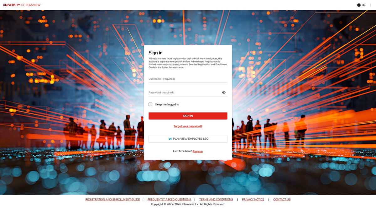
caused users to question whether they had missed a page on the way to the login, according to my UoP colleagues
lacked true landing page feel: no introduction, no welcome, no overview of website contents or purpose
with no information on what UoP is, how do first-time users know if registration is worth the effort?
After
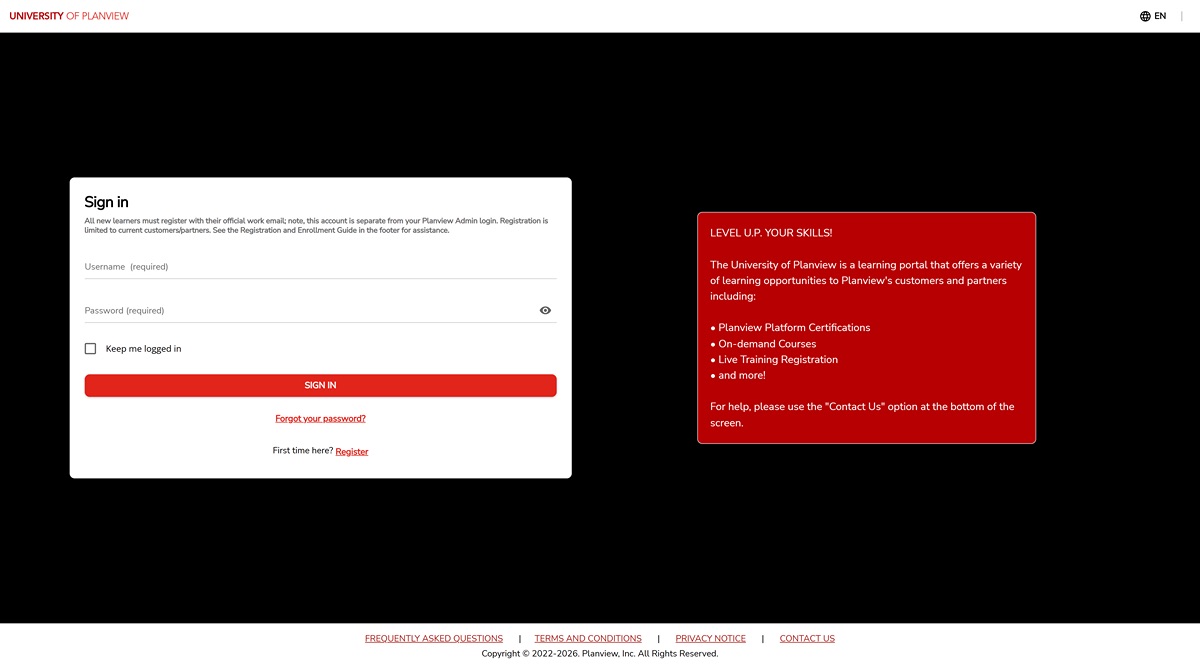
red informational box grounds users in the context of the UoP website with a summary of UoP's learning offerings
solid black background to match the minimalist look of Planview's new web style as seen on their other websites
eases pain points (1c) and (1d) by providing UoP a proper root for its hierarchy and utilizing branding in a simple way that doesn't disrupt flow
Customer Homepage
Before
an unnecessary median between login and access to relevant context, giving users a chance to head in the wrong direction away from what they need
a lacking sense of visual hierarchy: area above the fold is wasted with an unnecessarily large welcome banner and a full-width image widget
no intuitive shape to the page for facilitating a visual flow that guides the user
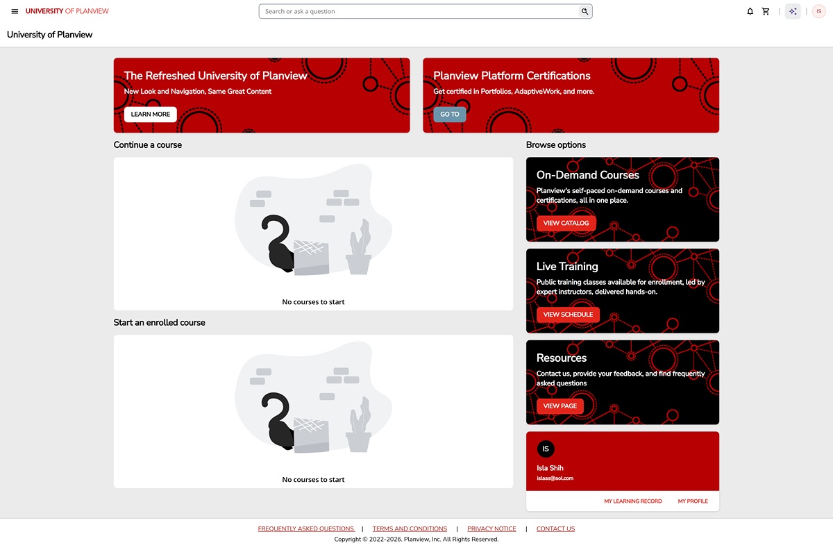
After
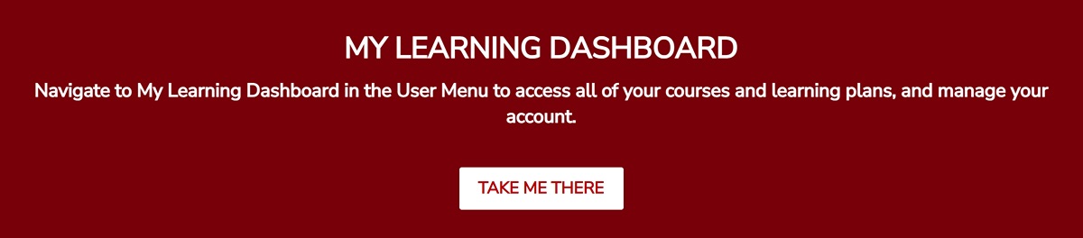
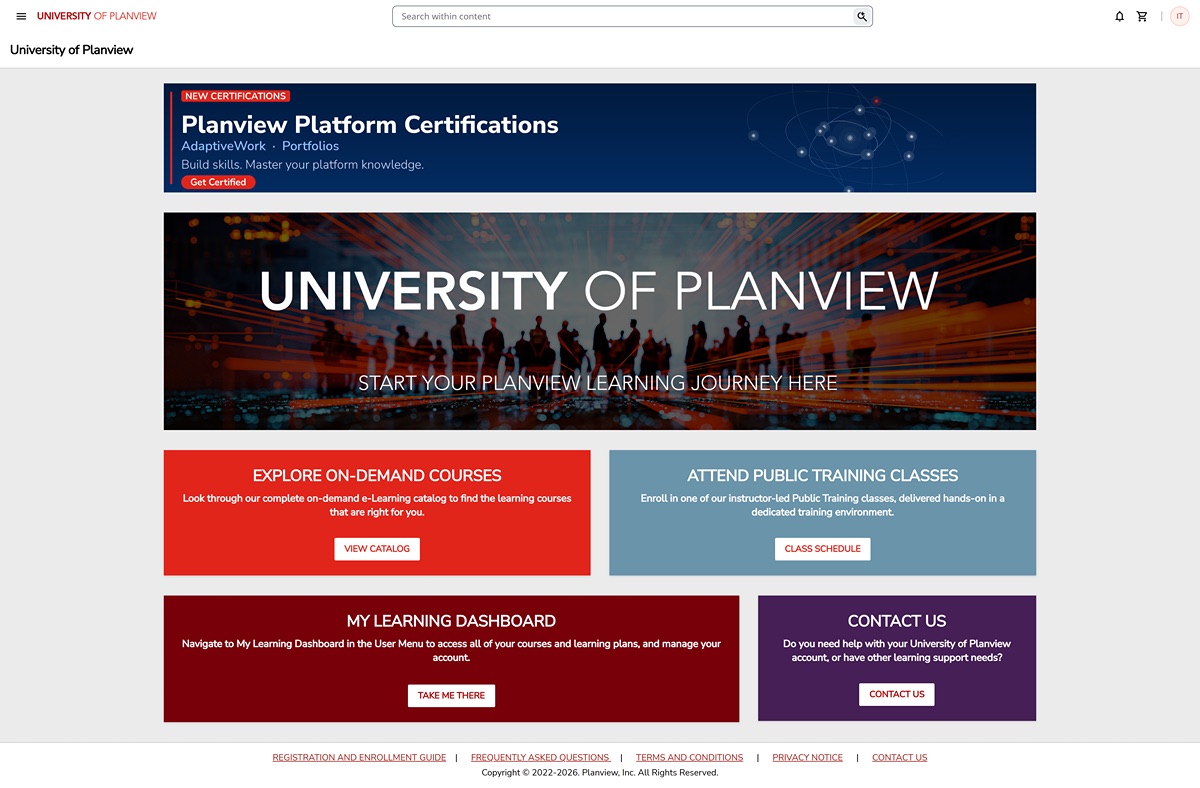
incorporates "My Learning Dashboard" page so that users can continue learning and access profile settings and learning data from the homepage
rearranges remaining links in a logical system: customer-specific highlights on top, general resources to the side
graphics match latest visual motifs of Planview's web development team as used on other Planview websites
eases pain points (1c) and (1d) with an on-brand, intuitive interface
directly addresses pain point (2a) by incorporating personalized learning into the homepage itself
Partner Homepage
BeforeAfter
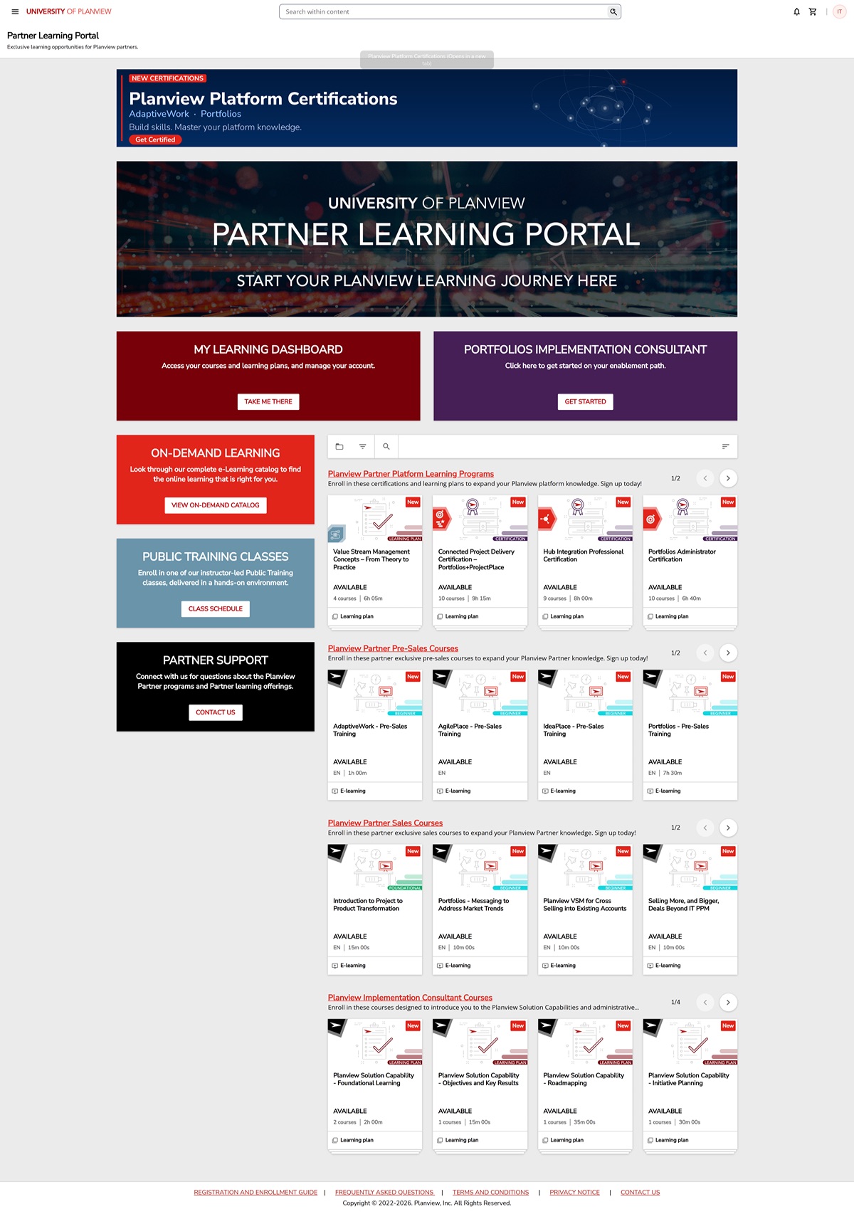
Before: ad hoc construction that clumsily attempts to highlight partner-exclusive content while not providing individual users relevant content
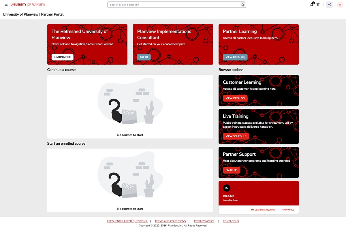
After: layout is consistent with logical system of customer and employee homepages, facilitating cross-page editing with less translation
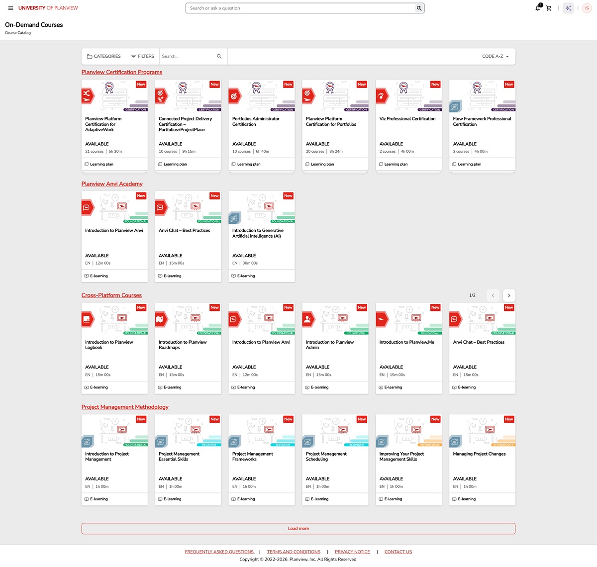
Course Catalog
BeforeAfter
Before: three separate catalog widgets that cannot be cross-searched and take up space even when another catalog widget has a filtered applied
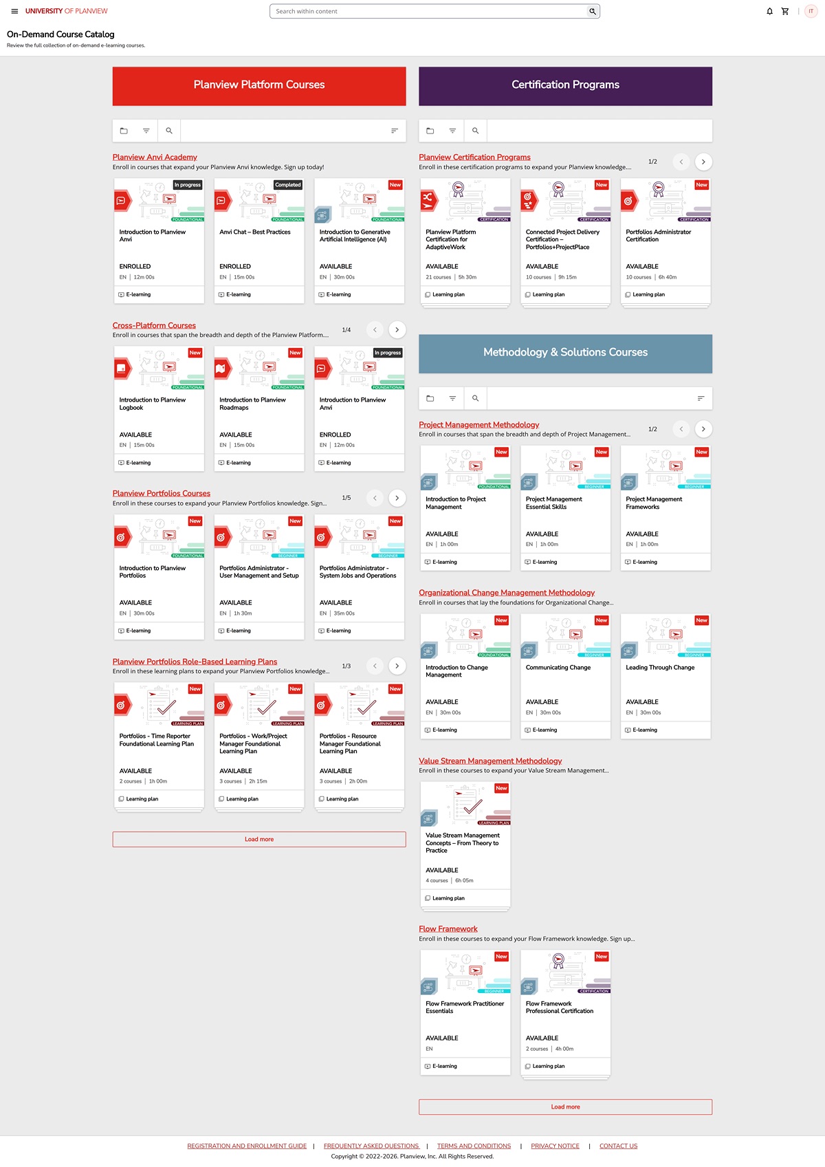
After: single, full-width catalog widget that reveals labels for search/filter features and allows the user to search/filter across all learning content
addresses the confusion that causes pain point (2a) by making searching/filtering options both more capable and more conspicuous
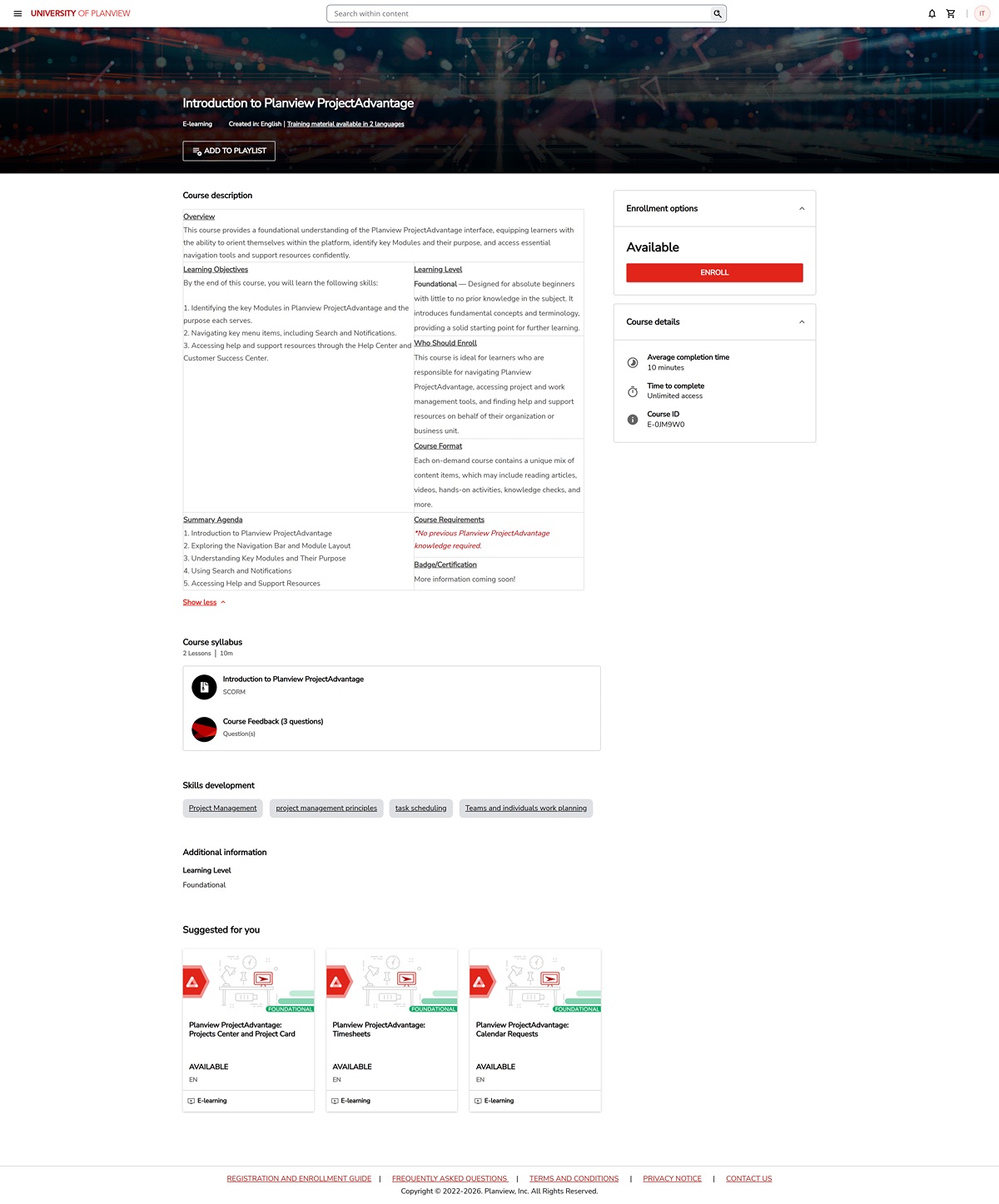
Course Pages
Before
description stuffed inside nonlinear HTML table
screen cluttered with elements not relevant to the user, like a "Syllabus" (just shows e-learning files) and skill tags used for metadata purposes
part of description collapsed by default, adding friction for users scanning information
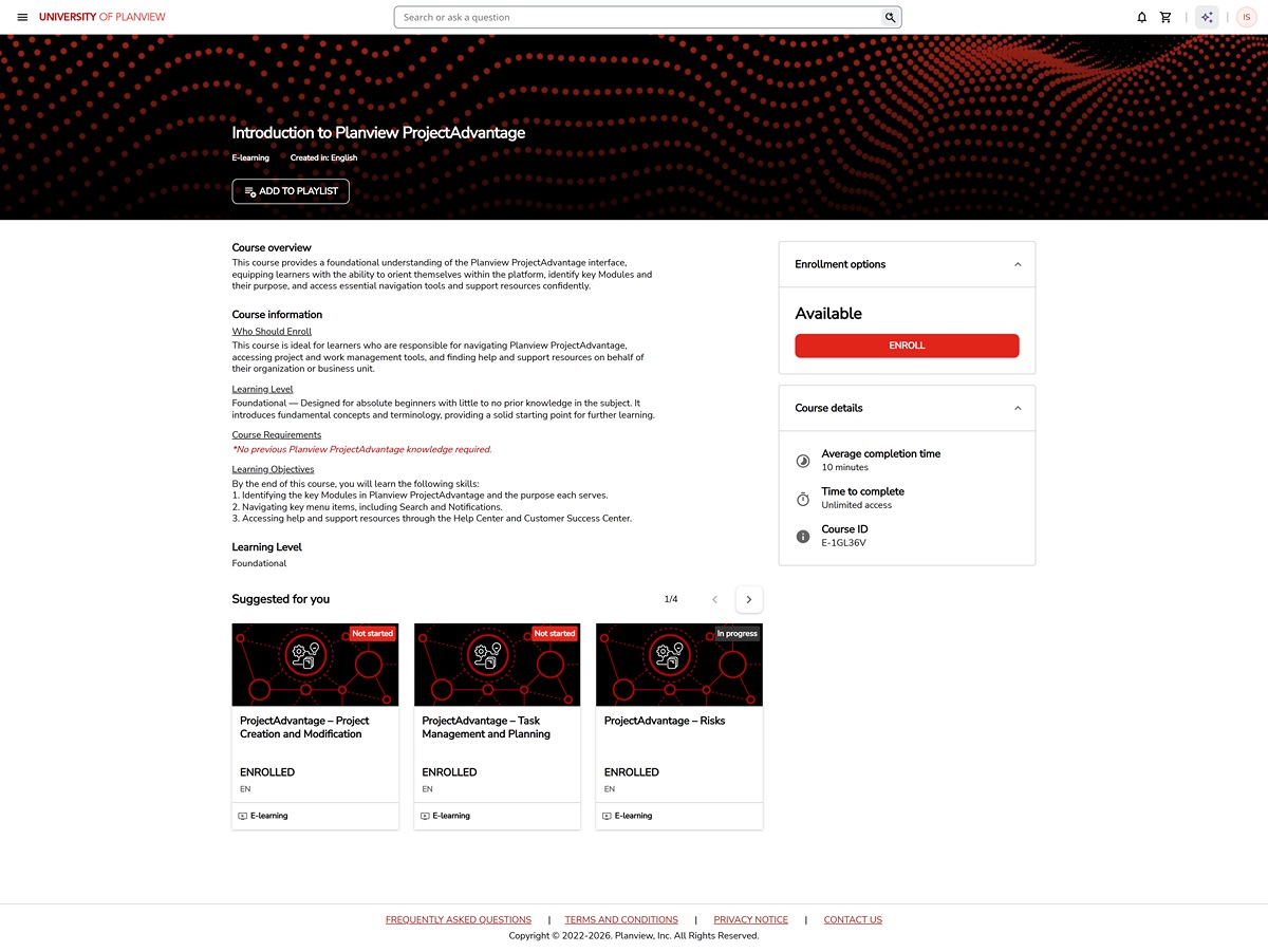
After
linear scheme that promotes human-readability, so users can scan to determine if the learning content suits their needs; and machine-readability, so UoP's sitewide search can be more efficient
description split into two sections: an elegant overview which shows up wherever the learning item is referenced elsewhere and further information formatted for quick scanning by the user
since hundreds of pages needed to be updated to implement these descriptions, I used Planview's internal AI to create agents which facilitate filling the HTML template of new descriptions and migrating the HTML from old descriptions into the new format
eases pain point (1c) by smoothening out visual flow for users scanning course information
For all of this, I wrote up a document summarizing the what, why, and how of the redesign. For each change involved in the redesign, I wanted my team and anyone who worked with UoP in the future to know what specifically changed, why the change was made, and how the change was actually put into effect. This goes back to the maintainable design philosophy I've been mentioning: I want people to understand the backend of the design even when I'm not there. UoP's custom CSS was similarly documented via in-code comments in a neatly formatted stylesheet, making the language of the styling sensible to even someone who knows nothing about CSS.
Personal Takeaways
This project was satisfying for me because I brought a website, however small, from the beginning to the end of a redesign. I consider this project to be my first real-world design experience and, through it, I learned a number of important things about what I value as a designer:
I value working with a team, because design has a fundamentally social purpose and the product benefits when the work itself is social
I value maintainability in design, because no digital product ever fully exits the design stage, so its design should keep in mind all the future modifications that will probably be made to it
I value redesigning an existing product by a process of adjustments, rather than from scratch, because I believe people benefit when their systems are familiar and go through small changes frequently, rather than being totally replaced occasionally
I thank Planview, the Global Learning department, and the UoP team for the opportunity to lead this project. As much I've influenced this website, you have influenced me.